The BioXplore approach
BioXplore exists to present a manageable subset of a very large biological database, contextualised around one specific thing at a time — a disease, a gene, or a biological process. It uses graphical models to represent, explore and interact with what lies underneath.
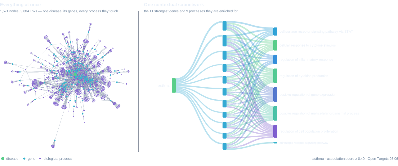
The reason it works this way is a negative result. The catalog holds 7,554,123 scored gene–disease links across 26,517 diseases and 20,097 protein-coding genes. Drawn as a single network, all at once, that is uninterpretable — and not because of a shortcoming in the drawing software. A graph that size remains perfectly amenable to high-level network analysis: you can measure its degree distribution, find its communities, rank its hubs by centrality. What you cannot do is read it. Nobody has ever looked at a hairball and learned which genes matter in asthma.
So BioXplore does not draw the network. It draws visually tractable subnetworks: small views assembled around whatever you anchored on, where every element earned its place by a stated rule, and where the view says what it left out. The figure below is the same disease, at the same evidence threshold, rendered both ways.
What the data is
Three kinds of thing, and the links between them.
| Genes | 78,691 human genes (20,097 protein-coding). A gene is a stretch of DNA; most of the interesting ones encode a protein. |
|---|---|
| Diseases | 26,517 disease terms, arranged in a hierarchy — allergic asthma sits under asthma, which sits under respiratory disorder. |
| Functions | 38,263 Gene Ontology terms describing what genes do, also arranged in a hierarchy. 641,624 annotations link genes to them. |
| Associations | 7,554,123 scored gene–disease links, each assembled from up to 20 independent evidence sources. |
All of it comes from the Open Targets Platform, released under CC0. See Docs for exactly what each source contributes.
Why the obvious picture fails
Join disease to gene to function and the result is unreadable for three reasons, each of which turns out to be measurable rather than merely assertable — and each of which therefore has a fix that can be written down.
The first is that generic categories swamp specific ones. The Gene Ontology
term protein binding is annotated to 13,295 of
20,097 protein-coding genes, and it has company: nucleus,
cytoplasm, membrane. These are true of nearly everything and so
distinguish nothing, yet they dominate any diagram that counts annotations, because
they are attached to the most genes. The fix is to score a term by its
information content — how surprised you should be that a gene carries it,
which is the negative logarithm of the fraction of genes that do. Terms that apply
to everybody score near zero and fall out on their own, with no hand-maintained list
of banned words to keep current.
The second is that a disease's own relatives arrive looking like findings. Ask which diseases share genes with asthma and the strongest answers are asthma's parents and its children in the disease hierarchy. Every one of them is correct, and none of them tells you anything: of course allergic asthma shares genes with asthma. The fix is to compute the anchor's ancestors and descendants explicitly and remove them before anything is ranked, so that what remains is a genuine neighbour rather than a relabelling.
The third is that counting connections ranks noise first. Among asthma's genes, neurodegenerative disease shares 34 and chronic bronchitis shares 14 — so a diagram sorted by overlap puts neurodegeneration at the top. But 34 is 0.8× what chance alone predicts for a disease with that many genes, while 14 is 62×. The first is slightly less overlap than nothing; the second is a real signal. Everything in BioXplore is therefore ranked by the hypergeometric test — the probability of seeing an overlap that large by chance, given both set sizes — which is to say, ranked by surprise rather than by size.
Selection is the analysis
These rules are not cosmetic tidying applied after the fact. They decide what the picture says, and that has an uncomfortable corollary: so does every threshold set alongside them. Raise the confidence cut-off from 0.1 to 0.4 and 493 diseases that had twenty or more genes are left with none. Huntington disease shows 111 associated genes at the looser setting and 4 at the stricter one — the same disease, the same database, two irreconcilable pictures.
A tool that quietly picked one of those and drew it would be lying by omission. So every view in BioXplore reports what it dropped and why, including the things that could never have appeared at all — genes carrying no functional annotation, processes below the specificity floor, drugs that exist for no gene on screen.
The evidence lens
Each association is a weighted combination of up to 20 sources, and they are not interchangeable: some are human genetics, some are mouse experiments, one is a machine noticing two words near each other in an abstract. Open Targets down-weights the weaker ones — text-mining counts about a fifth of curated genetics — and combines them so that the strongest source dominates rather than being averaged away.
BioXplore lets you switch whole categories of evidence off, and then recomputes the score rather than filtering rows out of a fixed answer. The distinction is the product. Because the published score reproduces exactly from its component parts, a recomputed score is a real score and not an approximation of one, which means the tool can answer honestly the question a sceptic actually asks: what does this look like if I only believe human genetics? For asthma, dropping drug-target evidence does not clean the picture up — it changes the question, and the neighbourhood shifts from airway disease to autoimmunity.
98.6% of associations rest on a single kind of evidence. Sources explains what each one measures and where it stops being trustworthy.
What this is not
It is a reading of a public database, not a map of biology. It inherits that database's biases wholesale — a well-studied gene looks important partly because somebody studied it, and absence of evidence here is very often evidence of absence of funding. It was built with AI assistance, it has not been peer reviewed by the scientific community, and it is a good instrument for generating questions rather than a source to cite for answers.