User guide
The explorer answers one question at a time, about one thing at a time. You pick a subject — a disease, a gene, or a biological process — and it draws a three-column diagram of what that subject reaches. Everything else on the page either changes what counts as evidence, or tells you what was left out.
On this page: choosing a subject · reading the diagram · the controls · sources of evidence · clicking and re-anchoring · the tables · sharing and export · worked examples
Choosing a subject
Type into the search box. Disease names, gene symbols and Gene Ontology terms all
resolve in the same field — asthma, IL13,
regulation of cytokine production. What you pick decides the shape of
the diagram:
| If you anchor on… | You get | Which answers |
|---|---|---|
| A disease | disease → genes → biological processes or → drugs, see below |
What does this disease do, and through what? |
| A gene | gene → diseases → therapeutic areas | How far does this gene reach across medicine? |
| A process | process → genes → diseases | What does this mechanism cause? |
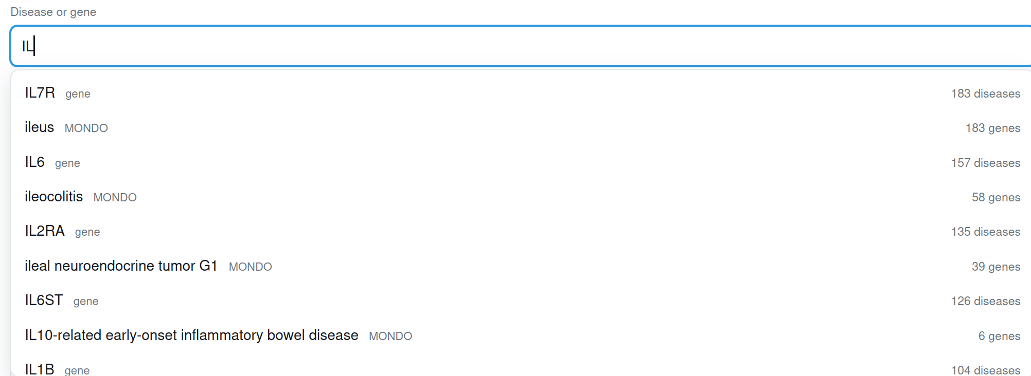
IL returns interleukins alongside the ileal diseases rather than burying one under the other. The figure on the right is the size of each result — diseases for a gene, genes for a disease or process.Reading the diagram
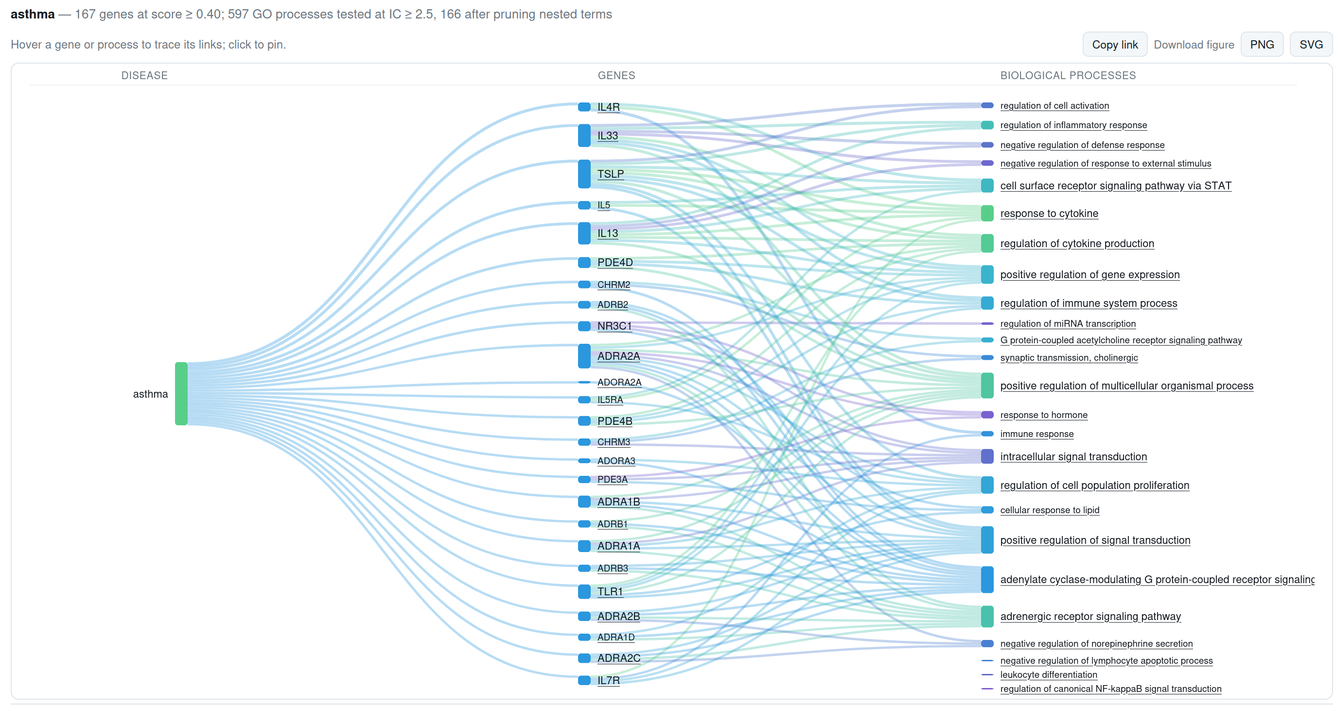
Each column is captioned, because three columns of coloured blocks look alike and a diagram you have to guess at is worse than a table. Read it left to right:
- The ribbons carry the association score. A thick ribbon from a disease to a gene means strong combined evidence for that link, under whatever evidence you currently have switched on.
- Genes are ordered by score, strongest at the top. The right-hand column is ordered to minimise crossings.
- Colour is inherited from the right, so you can follow a downstream category back through the middle column by eye.
- Nothing in the diagram is complete. The line under it always says how many genes were drawn out of how many qualified, and what happened to the rest.
The controls
| Association score ≥ | How much combined evidence a gene–disease link needs before it counts. This is the single most consequential control on the page: 493 diseases that have twenty or more genes at 0.1 have none left at 0.4. Move it and watch the footer. |
|---|---|
| GO specificity (IC) ≥ | How specific a biological process has to be. Low values admit protein binding and cellular process, which are true of almost every gene; raising it keeps only terms that actually discriminate. |
| Third column | On a disease, switches the right-hand column between biological processes and drugs. See the worked example below — with drug evidence switched on, the drug column is partly circular, and the tool says so. |
| Genes shown ≤ | The node budget. Raising it draws more; it does not change what qualified. The footer distinguishes the two. |

Sources of evidence
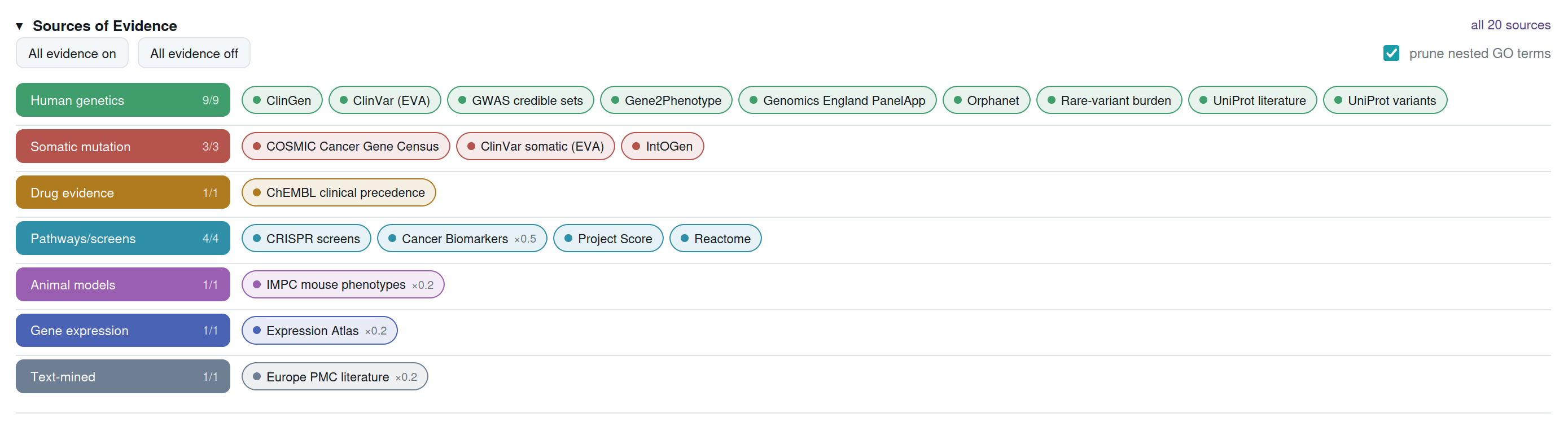
Open the Sources of Evidence panel and you get the 20 evidence sources, grouped by kind and colour-coded. Switch a group off and the score is recomputed — not filtered. The difference matters: the diagram you get is the one you would have got if that evidence had never existed, rather than the same diagram with rows hidden.
That is what makes the honest question askable. What does this disease look like if I only believe human genetics? is a different question from what is known about this disease, and the tool can answer both without pretending they are the same. The Data sources page explains what each source measures and what it is worth.
Clicking, pinning and re-anchoring
| Hover | Highlights the node and everything connected to it, dimming the rest. |
|---|---|
| Single click | Pins that highlight, so you can read the labels or export the figure with one path emphasised. |
| Double click | Makes that node the new subject, if it can be one. A breadcrumb appears so you can step back. |
Not everything is anchorable. Only 13 of the 22 therapeutic areas carry associations of their own; the rest are grouping terms and are drawn without an anchor rather than leading somewhere empty.
The tables underneath
Below the diagram are the full result sets, not just what was drawn. Each row says whether it made it into the figure and, if not, why — over the node budget, no functional annotation, no drug.
Click any gene row to open the evidence panel for that link. It shows every source supporting it, each source's raw score, its weight, its rank in the harmonic sum and what it contributed to the total — plus any curated publications, linked to PubMed. This is where a number becomes an argument you can check.
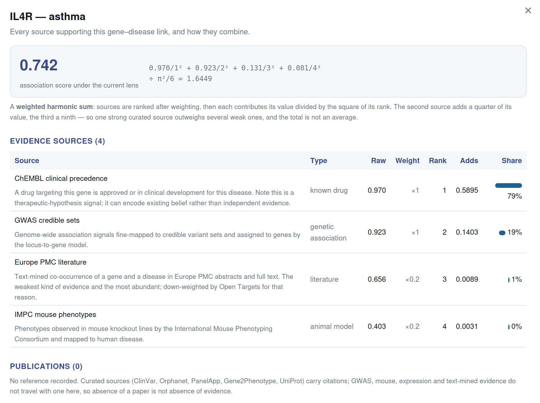
Publication references come from the curated sources, which are shaped around rare and monogenic disease. A common polygenic disease will show few or none. That is a property of this catalog, not of the literature — Data sources explains why.
Sharing and export
Copy link puts the entire view in the URL — subject, thresholds, evidence lens, third-column choice. Anyone opening it sees exactly what you saw, which means a claim made with this tool can travel with the settings that produced it.
PNG and SVG download the figure with a caption bar carrying the thresholds, the evidence lens and the selection footer, plus the BioXplore mark. A Sankey without its parameters is not a reproducible claim, so the export refuses to be one.
Worked examples
1. What is asthma, according to the data?
Anchor on asthma, leave everything at its default. You get interleukin genes — IL13, IL33, IL4R, TSLP — running into cytokine signalling and inflammatory response. That is the modern picture of asthma as a type-2 inflammatory disease, and it falls out of the data without being asked for.
2. The circular drug column
Still on asthma, switch the third column to drugs. With all evidence on you
get ADRB2, CHRM3, PDE4A and their own inhalers — salbutamol, ipratropium,
theophylline. That is circular: clinical_precedence evidence put those
genes in the column because those drugs exist. The tool warns and offers a
one-click exclusion.
Take it, and the same query returns IL13, IL4R, IL33 and IL6R — and now the drugs are a finding. Tocilizumab and sarilumab block IL6R, are approved for rheumatoid arthritis, and are not indicated for asthma. Whether that means anything is a question for a trial, but the tool has posed it rather than buried it.
3. Following a gene outward
Double-click IL13 to re-anchor. The view becomes gene → diseases → therapeutic areas, and you can see how far one cytokine reaches: asthma, atopic dermatitis, allergic rhinitis, and on into other immune conditions. Double-click any of those diseases to turn around and look back.
What it will not tell you
The explorer reports associations, not mechanisms and not causation. It cannot tell you the direction of an effect, whether a gene is up or down, or whether a link would replicate. It reflects what has been studied, so a well-worked gene looks important partly because somebody worked on it. Treat every view as a question worth asking, not an answer.